
-
Only registered members can see all the forums - if you've received an invitation to join (it'll be on your My Summary page) please register NOW!
-
It's easier than ever before to check your entries from the 1881 Census - more details here
You are using an out of date browser. It may not display this or other websites correctly.
You should upgrade or use an alternative browser.
You should upgrade or use an alternative browser.
How You can Help Yourself to Taste Success!
- Thread starter Red Dragon
- Start date


Red Dragon
LostCousins Megastar
Thanks for all the feedback! It's good to know people are actually finding it useful.
I've taken some suggestions (thanks everyone), and placed them here for a review.
Let me know what you like, the red line is a trendline. Corrected the dates (just the dates were wrong), changed their format to be International, etc.
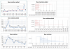
Here's the old style graph for the same period
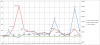
I've taken some suggestions (thanks everyone), and placed them here for a review.
Let me know what you like, the red line is a trendline. Corrected the dates (just the dates were wrong), changed their format to be International, etc.
Here's the old style graph for the same period


Heather
LostCousins Member
I agree the left graphs are better for me alsoThe three separate graphs on the left for me.


Bryman
LostCousins Megastar
It is good to see more comments being posted but it is still a very small proportion of viewers that are making their opinions known.
I agree with those that think the 3 graphs on the left are easier to compare/understand, because the data for each date lines up vertically.
The horizontal bars in the charts on the right will only be equally clear if the 3 charts are placed next to one another horizontally.
I do not like the figures being displayed in tabular form horizontally across the bottom when the bars are not vertical.
However, I now think that the old style graph could be the one to stick with as it has been 'opened up' and decluttered.
It would be better without the figures being displayed on the graphs but rather shown in three coloured rows across the bottom. The colours would match their respective lines on the graph.
I would still also like to see some sort of comment if possible to account for peaks and troughs.
I agree with those that think the 3 graphs on the left are easier to compare/understand, because the data for each date lines up vertically.
The horizontal bars in the charts on the right will only be equally clear if the 3 charts are placed next to one another horizontally.
I do not like the figures being displayed in tabular form horizontally across the bottom when the bars are not vertical.
However, I now think that the old style graph could be the one to stick with as it has been 'opened up' and decluttered.
It would be better without the figures being displayed on the graphs but rather shown in three coloured rows across the bottom. The colours would match their respective lines on the graph.
I would still also like to see some sort of comment if possible to account for peaks and troughs.

One of the most useful things that could be added is a moving average line, the point of that is that is shows the general trend rather than specific spikes thus gives a far greater amount of information over random noise of individual peaks and troughs.
Note that the trendline is just a regression analysis line of the trend, whereas a moving average line shows the changes in the trend.
I'd agree with Pauline that if you are having 3 graphs they ought to show the same time period. I'm guessing that was just a slip up?
Edit: I noticed after I'd posted that at the top of the next page Peter had also suggested a moving average. What is it that they say again? Or does that make us fools?
Note that the trendline is just a regression analysis line of the trend, whereas a moving average line shows the changes in the trend.
I'd agree with Pauline that if you are having 3 graphs they ought to show the same time period. I'm guessing that was just a slip up?
Edit: I noticed after I'd posted that at the top of the next page Peter had also suggested a moving average. What is it that they say again?
Or does that make us fools?
Red Dragon
LostCousins Megastar
Hi Everyone!
Here's a weekly update on how well people have been doing over at LostCousins.
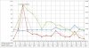
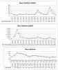
Lots of good feedback and suggestions, thanks everyone. I think I've incorporated most if not all of the suggestions. The thin coloured lines are the 2 point moving average for their respective thick coloured lines. I've also moved the blue and green lines so that they are now on the primary axis (the one on the left that goes from -400 to 1,400).
I think the combined graph is the way to proceed, do you want the moving average? Does it make it too cluttered? Any other suggestions?
Here's a weekly update on how well people have been doing over at LostCousins.
- 36 new members joined the LostCousins site
- 1,089 new entries have been added and
- 60 relatives have been matched.
Lots of good feedback and suggestions, thanks everyone. I think I've incorporated most if not all of the suggestions. The thin coloured lines are the 2 point moving average for their respective thick coloured lines. I've also moved the blue and green lines so that they are now on the primary axis (the one on the left that goes from -400 to 1,400).
I think the combined graph is the way to proceed, do you want the moving average? Does it make it too cluttered? Any other suggestions?


That's a good point, but it looks like Red is showing about 16 weeks, using 12 points for example would therefore show a line for the last 4 weeks on the chart. This would just flatten out the line, would still be useful? To make it look better we'd need more data points, and that brings us back to having a more crowded chart.
Might I suggest to Red he looks at weighted moving averages over a longer period this would mean less jumps in the graph and tie the data towards the long term averages without the latest data perturbing the graph too much.
This could be achieved by calculating the moving average over the entire original period and only plotting it for the last few months.
This could be achieved by calculating the moving average over the entire original period and only plotting it for the last few months.
Bryman
LostCousins Megastar
To make it look better we'd need more data points, and that brings us back to having a more crowded chart.
One doesn't have to show all points that the graph is created from, ie Red could have data for several months but only show the last few weeks on the graph each week. That way the new uncluttered look would be maintained.
I think that everything is much clearer without the figures appearing on the graphs. Well done. Perhaps each row of figures under the graph could be displayed in the colour of the appropriate data line in order to make the association more obvious and maybe the points could be plotted in the centre of the column for any given date? Something seems to have gone slightly awry with the dates shown on the New Matches graph. The other two look much tidier.
One further question though . . . do we still need the legends on the two vertical axes? I think they just introduce confusion as to which is appropriate for each line of the graph. What do others think?
Red Dragon
LostCousins Megastar
Hi Everyone!
Here's a weekly update on how well people have been doing over at LostCousins.
Thanks for the comments on the new layouts. A single combined chart is much easier for me to maintain and that seems to be the general consensus. I've tried to incorporate all the suggestions.
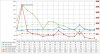
The solid lines are the main data lines and the dashed lines are the average lines. The average values are calculated from the previous 20 data points. The left hand axis is for New Members and New Matches, the right hand axis is for New Relatives.
Unfortunately I can't colour the data values under the chart, unless someone knows how to?
So big drum roll, and here is the new chart. I welcome any comments or questions.
Here's a weekly update on how well people have been doing over at LostCousins.
- 46 new members joined the LostCousins site
- 1,502 new entries have been added and
- 93 relatives have been matched.
Thanks for the comments on the new layouts. A single combined chart is much easier for me to maintain and that seems to be the general consensus. I've tried to incorporate all the suggestions.
The solid lines are the main data lines and the dashed lines are the average lines. The average values are calculated from the previous 20 data points. The left hand axis is for New Members and New Matches, the right hand axis is for New Relatives.
Unfortunately I can't colour the data values under the chart, unless someone knows how to?
So big drum roll, and here is the new chart. I welcome any comments or questions.